
Designers have started creating sites as art, as interactive projects or that simply exist for play and delight. They found ways to show off new techniques or create websites for their own sake.
Today’s designs, find creative ways to use typography, grids and lines, and simple navigation. Updated styling, with a lot of muted colors and sophisticated textures, keeps sites from feeling too retro. But web design is also moving into the future with exciting contemporary techniques such as: advanced interactions, animations and visual effects. And designers are using no-code tools to enable them to do it all faster and easier than ever before.
Websites should be more accessible, easy to navigate and flow seamlessly. With this in mind, designers today feel more in their zone, and more secure with their designs. This creates an atmosphere of freedom allowing them to test the boundaries of convention. As society spends more of its time online, a web creator’s job, is to engage users on an emotional level, carrying human sentiment within an artificial reality. Therefore, it is imperative for a web designer, to constantly evolve each technique.
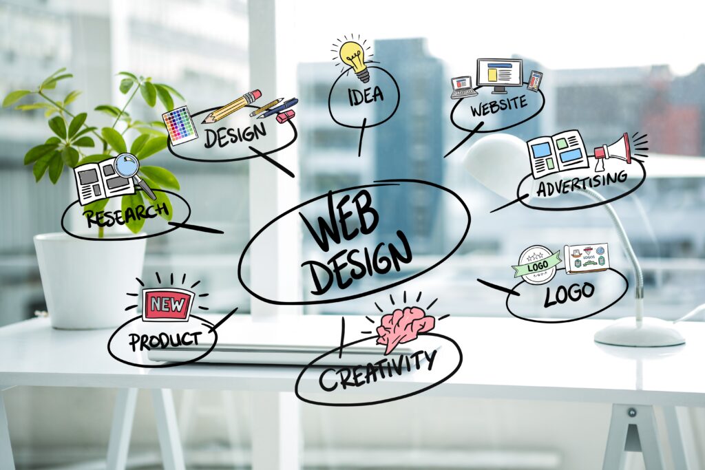
Discover below the latest web design trends:
1. One-page websites
Sometimes the most effective site is the least complex one. We have seen the increasing popularity of the one-page website that forgoes menus and navigation in favor of simple scroll navigation. One-page sites work best when their subject matter is narrower, like a portfolio or the presentation of a single idea.
These sites evoke the feeling of holding a flyer or reading a poster. All the information you need to review is in one place without the distraction of navigation or searching multiple pages. A one-page website, uses a consistent structure so that the viewer doesn’t get lost. It also reduces distracting elements (no background, big images, or movement).
2. Horizontal Scrolling
When you think of “scrolling” on websites and applications, one direction probably comes to mind first: downward. This makes sense — virtually every web page structures its content vertically. To see more, simply scroll down with your mouse, trackpad, or keyboard. In contrast to familiar and intuitive vertical navigation, a side scroll layout can lead to surprising interactions between texts and images.
This is especially true for portfolio websites, catalogs, maps, and the like. Discovering projects, exploring cities, and visiting online galleries is far more engaging with sideways navigation. Horizontal scrolling can make a website more appealing, fun, and memorable. The fluid motion of different design elements creates a sense of progression even when static, driving the user to keep scrolling.
3. Art deco motifs
Art deco motifs fit well with the geometric designs that have been trending over the past few years. This year’s trend takes inspiration from the clean, curving lines and repetitive graphic shapes of art deco illustration and architecture. These elements can inspire beautiful logos, fonts, spencer motifs, borders and illustrations. To effectively design in this style, it helps to understand the philosophy behind the original art deco movement.
Art deco combined elements from the natural world with the modernity of the machine age-bold lines, symmetry, simplicity, and unvaried repetition of elements. The Alegria art style that BUCK designed for Facebook, appears to take a lot of cues from art deco’s depiction of human figures. The clean, curving lines, oval faces, reduced detail, and exaggerated proportions all call to mind this art style. Perhaps a new type of modernist figure design, could be an updated version of this trend.
4. Extraordinary imagery
Where does the line between real and imagery begin? When you look at a lot of websites, you might not be 100% sure. And that’s ok. Have fun with this trend and merge the real and imaginary to create pretty extraordinary imagery. Your imagination is the only limit here. In the example from K Plus Film, the people are situated on top of fruit that’s flying around the screen.
5. Visible borders
Web design likes to create a sense of magic-or at least the illusion that the content is neatly arranged by an invisible hand, floating freeform in digital space. The reality, of course, is that websites are built on a strict grid and held together with a code. For 2022, web designers are looking to get a little more real with layouts that reveal their foundation through simple borders and frames.
A visible grid has the obvious benefit of distinguishing one section from one another. This makes the page easier to scan while allowing for more content without the page feeling crowded. These simple borders also give websites a subtle, retro touch that pairs well with other 90s-adjacent trends making a comeback.
These webdesign trends are developing. Think about how you can merge these elements into existing projects or as a part of something new. The KJ WEB OFFICE teams inform you of the evolution of web trends and support you in your online presence.